We renewed the woku landing: the day the CSS beat us (and we accepted it)

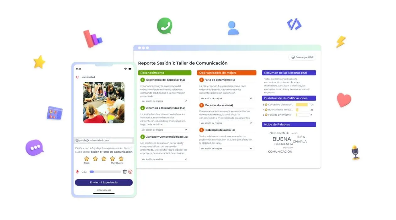
We renewed the woku landing: we migrated from Webflow to Next.js + Tailwind, added Ghost and Mintlify, and used AI to accelerate design and copy. What we learned and why the site now better accounts for our impact on education and events.
We hadn't written here since the beginning of the year, but it wasn't “silence”: it was iteration.
What has changed in woku in these months
In 2025, we focused on one thing: understanding where woku actually moves the needle.
Without lengthening it (there will be a post for that), the pattern was clear:
- Where we capture the most reviews today: education and events.
- In some cases we saw up to ~ 80% response rate.
- This wealth of data allows teams to make decisions faster and with more confidence.
And when your customers renew annually, the question is simple:
is the landing counting this... or is it counting “a generic product”?
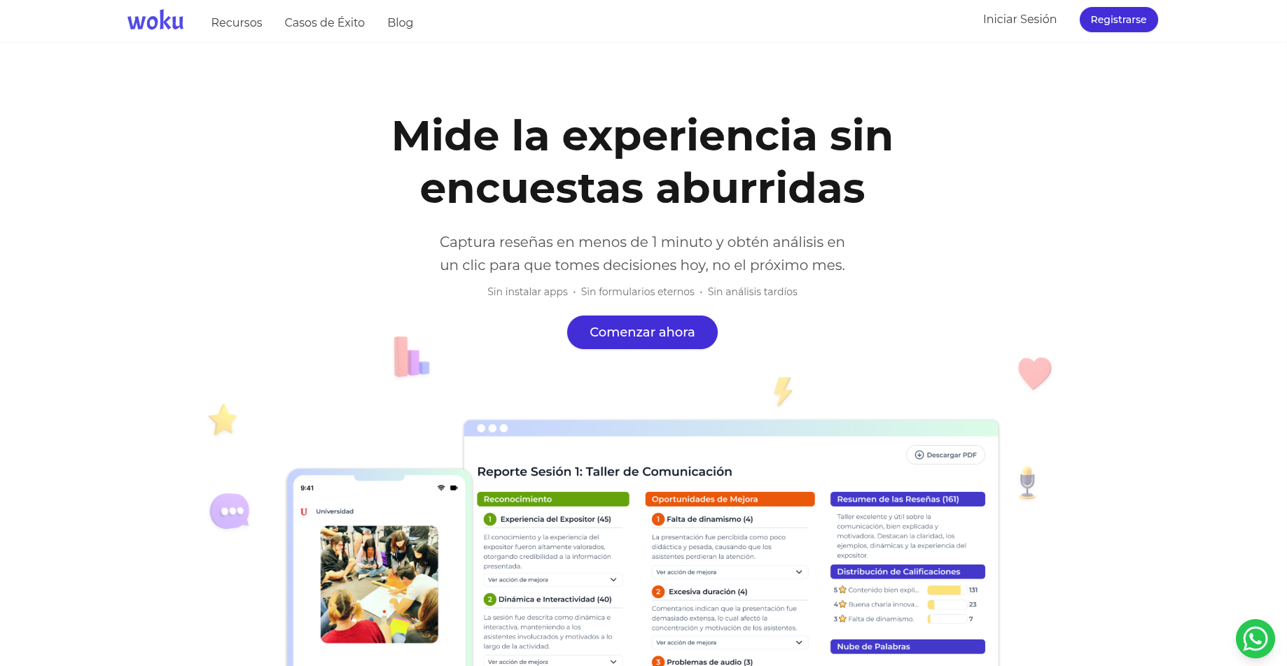
Webflow gave us speed... until it stopped giving it to us
Webflow was an excellent decision in 2023 and early 2024. At that time:
- We needed to iterate quickly.
- We didn't want to put hours of development into every copy/section change.
- The “no-code” bought us focus.
The problem is that time passes, the site grows and friction builds up.
What really started to hurt (mostly to Paula because she was managing it):
- CSS that became a nightmare: you fixed a margin and exploded a dimension in another breakpoint.
- Small changes that ended in “let's not touch it because it breaks”.
- Performance and editing that felt slow for the pace we wanted.
Meanwhile, the GenAI market brought out new and better tools (Lovable, Cursor, Claude Code, etc.). And it started to make noise for us to keep “fighting” with the editor, when we could return to what we know well: code + good tooling.
The decision: return to Next.js... The reliable old woman
We made a very unromantic decision: moving the landing to Next.js + Tailwind CSS.
Not out of fashion. By control.
- Next.js: for serious structure, performance and SEO.
- Tailwind: to iterate UI without “the style sheet” becoming a minefield.
- Cursor: to build faster (including flows where the model opens the browser, looks at screenshots and helps you close style details).
- Parallel agents: if you organize yourself well, it accelerates you. If not, it creates chaos for you. (There is no middle ground.)
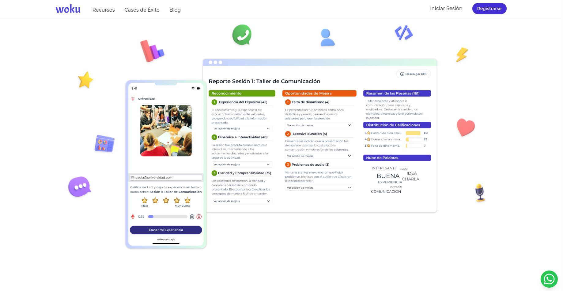
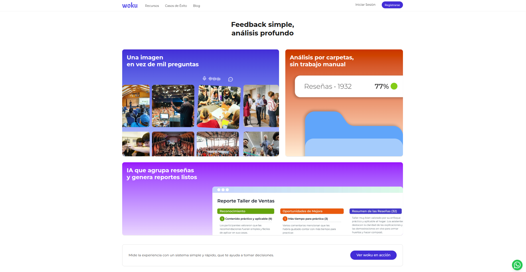
The site had to tell a story, not a list of features
A common mistake in B2B landings: “we have this, this and this”.
We wanted something else:
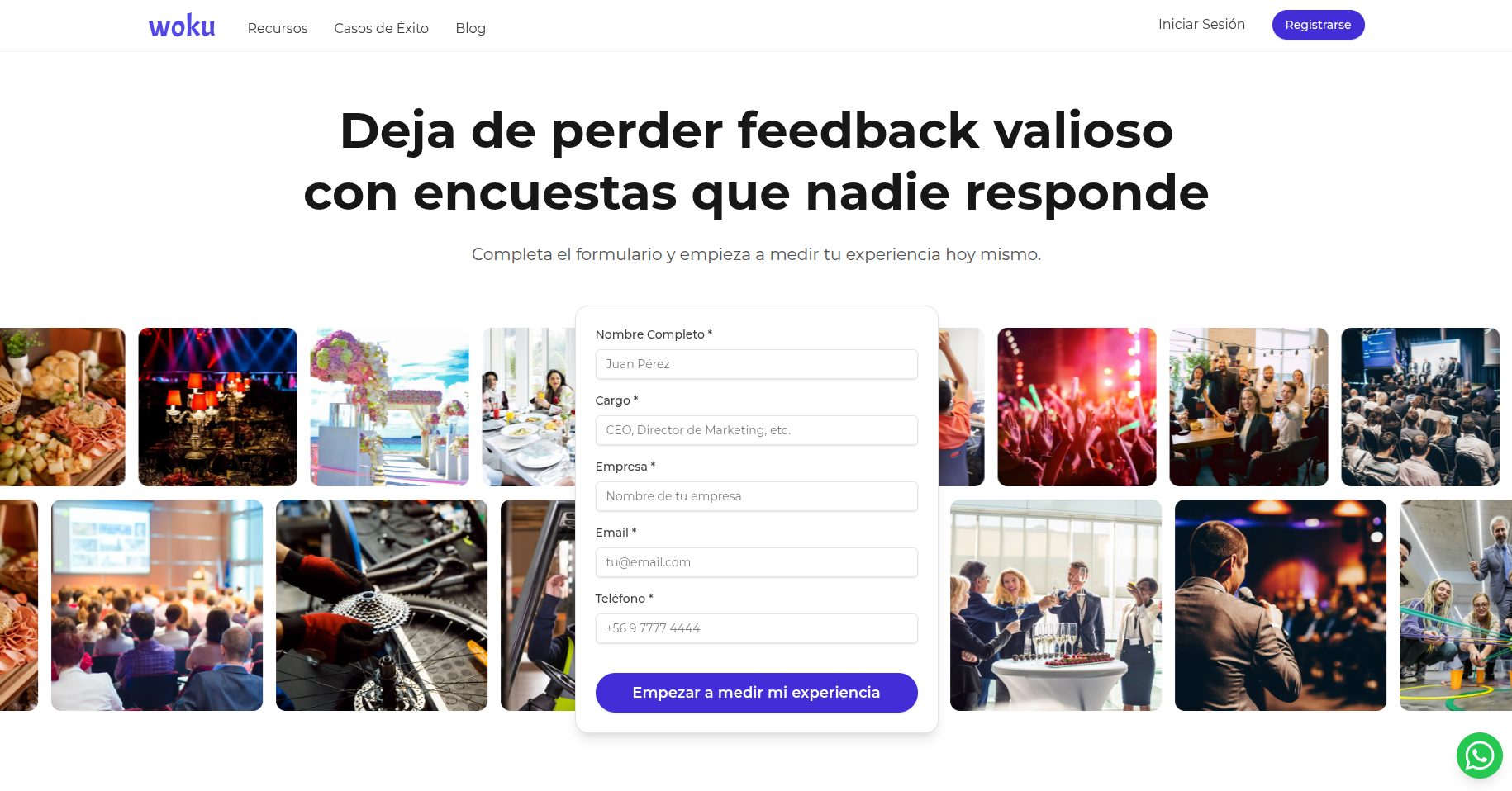
- Start with the real problem: surveys that no one answers.
- Show the contrast: simple feedback, deep analysis.
- Make the use clear: education and events, without hiding it.
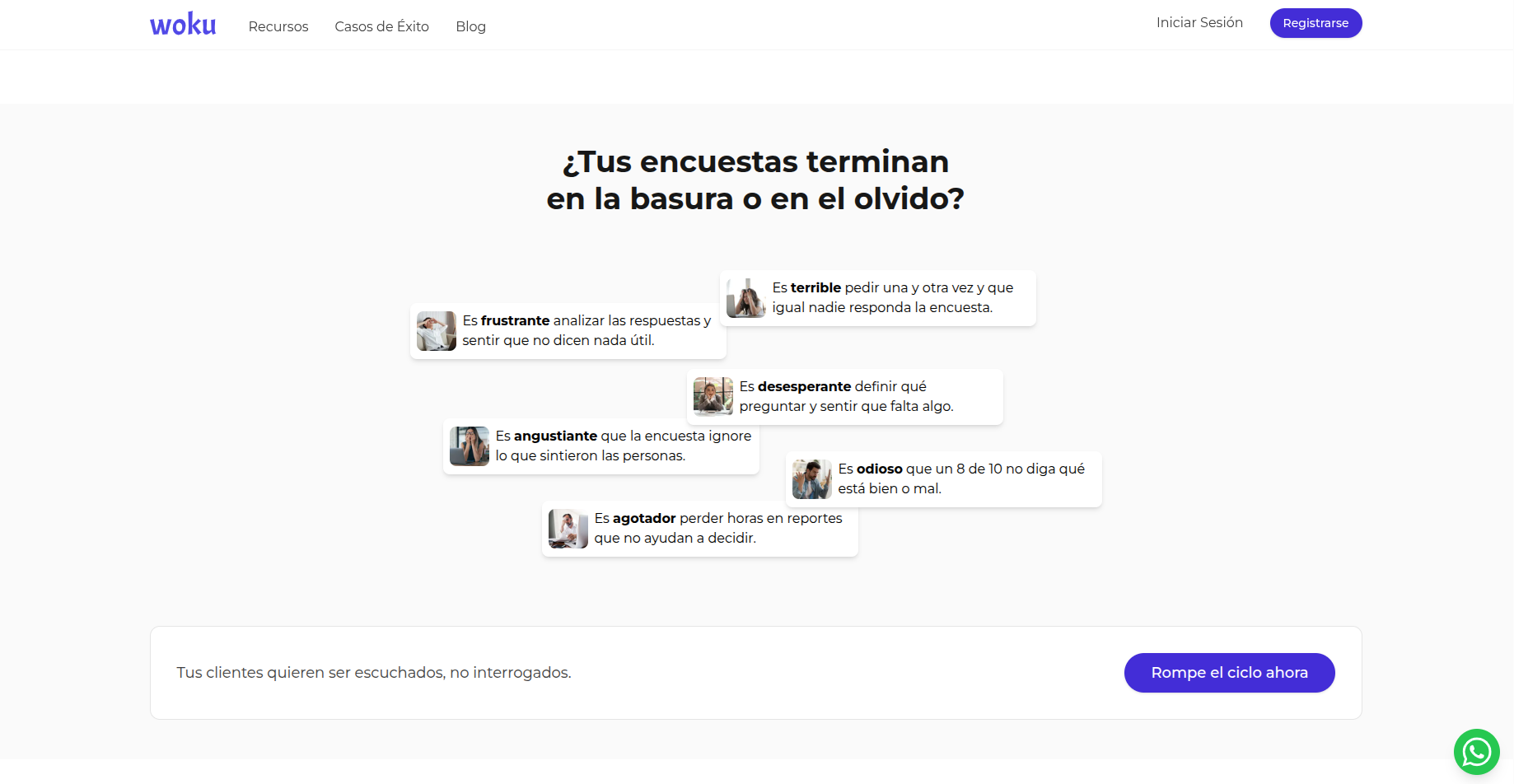
Our 2025 stack to move fast
We choose tools with one criterion: that they save us time on critical tasks, not that they look good in a tweet.
Sitio
- Next.js + Tailwind CSS: basis and speed for iteration.
- Figma: design and visual system.
- Photos: Canva library (fast, consistent, without overthinking).
Content and Documentation
- Ghost: blog and success stories.
- Mintlify: documentation.
Copys and research
- ChatGPT, Gemini and Perplexity: each one provides a different contribution.
- “Deep Investigation” mode when needed, and when not: short, direct prompt.
Project Management
- Notion: tasks, checklists, migration, decisions. I used to hate Notion, but now with the AI chat and the calendar it convinces me.
Inspiration in big
We look at landings that do the basics right: clarity, visuals, and frictionless navigation.
- Canva
- GitHub
- Figma
- Notion
- Shopify
Not to clone them (even if you can copy, why reinvent the wheel). To answer:
What do you mean in 5 seconds? What is meant by 30?
The elephant in the room: migrating more than 100 posts
Yes: blogging was a logistical pain. Migrating +100 posts is not “export/import and that's it”.
What helped us:
- Define a minimum standard (slugs, titles, excerpts, images, categories).
- Automate what can be automated.
- And to accept that “perfect” was the enemy of “published”.
That's the kind of task where choosing the right tools saves you weeks.
We re-attacked the original problem: lengthy surveys
Woku is, technically, a survey. But in practice it's another thing:
- A simple question that is represented in an image.
- A frictionless input (text or audio).
- Actionable reports in one click.
On the new website, we wanted to make it feel like this:
- Less text.
- More product on screen.
- More “that's how it looks”, less “that's how it sounds”.
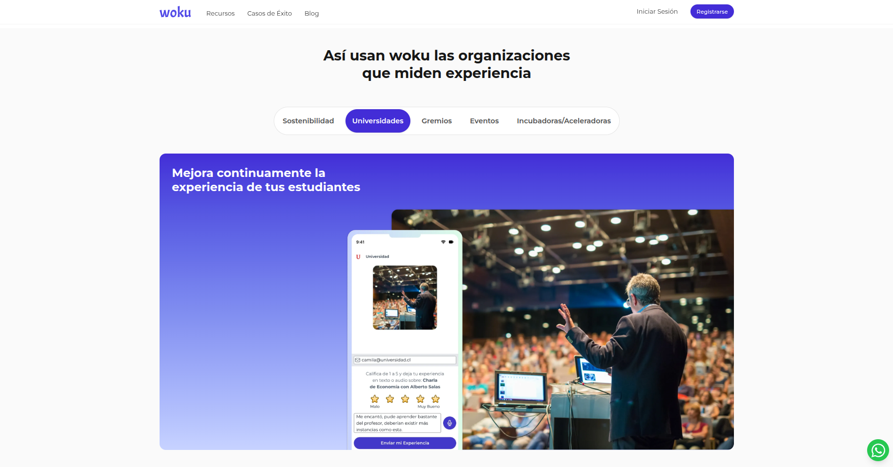
Education and events ceased to be “just another case”
We don't hide them on a menu. We make them the center.
Because if a prospect comes in for education, they want to see education.
And if you enter for events, you want to see events.
He doesn't want “a horizontal solution for everyone”.
The best thing about renewing a website is not the web
The best thing is the side effect: it forces you to answer uncomfortable questions.
- What exactly do we sell?
- Who is it good for today (not in theory)?
- What part of the product generates the “ah, ok”?
It's great to see the work with Paula take shape into something that can be understood quickly.
And even cooler when that translates into customers making better decisions about their experience.
What's next?
The next thing is to write about what we left mentioned above, calmly and with data:
- What we learned by capturing feedback in education and events.
- What patterns we see in the data (without “magic AI”).
- What we're building to make analytics even more actionable.
In the meantime, if you want to see the landing and give us feedback (ironic, I know):
woku.app.